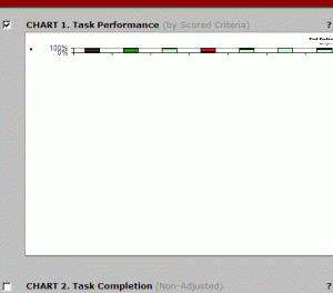
Are you using data logger 5.0 and your performance charts look like the image above?
My heart beat skipped a beat when I was done testing with 6 participants in a certain usability test where we were looking at 20 users in all.
I earlier had noticed that graphs were squished thought it was probably a minor bug which had to do with missing data of participants I had included for calculation but who were yet to come participate, and hence the screwed up graphs.
However, this was not the case. The graphs remained squished even after I excluded participants, who were yet to participate, for data analysis.
Cursing under my breath about the painful job it would be put manually feed data into excel in case I couldn’t get the graphs to ‘unsquish’ themselves, I soon found the solution to the issue after a bit of twiddling around.
Solution
- Left-click a chart (the whole border) and select ‘Chart Type’ from the menu.
- Under the ‘Options’ fieldset below the ‘Chart type’ window, click on ‘Default Formatting’.
- You’re done.
What are the other issues you face with the data logger? Or improvements you would like to see in future releases?


Leave a Reply