
The guy who broke all the rules of traditional typography, gave grunge typography an identity of its own, Raygun art direcrtor, David Carson walks through a gorgeous (and often quite funny) slide deck of his work and found images.
About David Carson
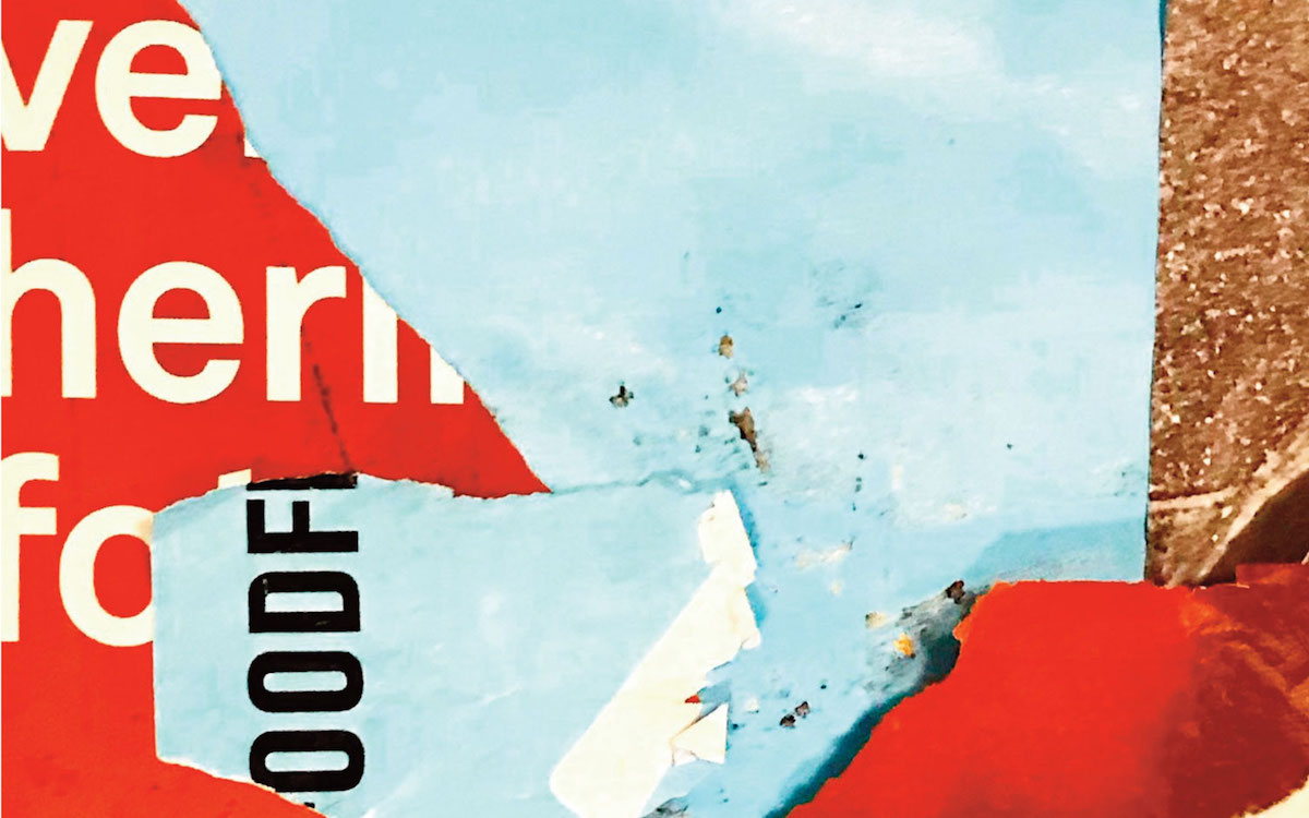
David Carson’s boundary-breaking typography in the 1990s, in Ray Gun magazine and other pop-cult books, ushered in a new vision of type and page design – quite simply, breaking the traditional mold of type on a page and demanding fresh eyes from the reader. Squishing, smashing, slanting and enchanting the words on a layout, Carson made the point, over and over, that letters on a page are art. You can see the repercussions of his work to this day, on a million Flash intro pages (and probably just as many skateboards and T-shirts).
His first book, with Lewis Blackwell and a foreword by David Byrne, is The End of Print, and he’s written or collaborated on several others, including the magisterial Book of Probes, an exploration of the thinking of Marshall McLuhan. His latest book is Trek, a collection of his recent work.
Other Links
David Carson’s website
Books by David Carson: The End of Print, The Book of Probes & Trek
Helvetica- The movie– Watch David Carson in the film and his take on expression through Helvetica, especially if you are into what I believe is the rather blind fanatic “Helvetica rocks and Arial sucks, but I really don’t know why though everybody says so” designer fad.
Leave a Reply